Planning Blog: title design
A key component of the final project has been the title sequence for our film's introduction. We have considered many different fonts and found one that gave off a mysterious and professional vibe. All of the titles will blend in and out of the sequence and be typed into the screen. Each one will be placed differently in the sequence depending on each shot.
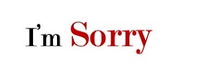
The titles will last 3 to 4 seconds depending on the shot. Depending on each shot, the color of the title may differ. For some, they will be red and others will be black. The title of our film is likely to be "I'm Sorry" where the "Sorry" is a reddish maroon color and the "I'm" is black. The "Sorry" will be subjectively bigger than the "I'm". This is a common convention we saw in many mystery movie title sequences. The rest of the titles will be black.
The font we chose to use for each title is "Modern No. 20". This font has a very professional look to it and goes with our mysterious vibe. It will look something like this:


Comments
Post a Comment